

Test Results Page
Problem to be Solved
When a mabl test fails, QA engineers need to quickly determine what went wrong.
mabl test runs capture a huge amount of important data that needs to be shown to users. This information is displayed on the test results page.
We had the opportunity to take all of this important information and display it in a way that was efficient and actionable.
Discovery
Evaluate the current test results page
Interview internal teams to learn about the history of the results page
Interview users to learn about their goals and priorities
Iterate and test
Low-fidelity wireframes
Medium-fidelity wireframes & user flows
Multiple rounds of usability testing, rapidly iterating between rounds
Motion design
Implementation
Design documentation
Review with internal stakeholders and teams
Collaborate with PM and engineering
Post-launch evaluation
Analytics data
Comments from users
Design Process
Discovery
Current Design
The test results page displayed a huge amount of information. Even though all of that information was useful, the page was difficult to use.
In the case of a failing test, the reason for the failure was not clear. Users had to sift through dozens of log lines, compare screenshots, and use trial-and-error to figure out why a step in the test failed.

Internal Interviews
Before anything else, it was important to learn the history of the current page.
How did it become disorganized?
What was the justification for all of the information shown?
What feedback and requests had users previously given us?
“Everything on the page was added in response to user feedback. Over time, we added so much information that it became pretty hard to use. “
— mabl employee
Initial User Interviews
Internal interviews were crucial for learning about the history of the results page. Ultimately, though, more weight would be given to input from end users.
I arranged interviews with a variety of users —from large companies and small; 1-person QA teams and teams of many people; more technical users, and manual code-less testers.
“It throws a lot of information at you, all at once. To figure out why my test failed, it takes way too long — I don't want to read, I want to scan. Just tell me what I need to know.”
— External user
“This is a page that I don't want to spend a lot of time on. I need to get in, determine why it failed, and then assign it to someone on my team to fix.”
— External user
Iterate and Test

Single column view
The steps in a test are arranged in a single column, with spacing between them proportionate to the amount of time each step took.

Two column view
A two column layout worked better than a single column. Test steps were shown on the left with step details on the right.

Clear representation of status
Users told me that the number one thing they cared about was seeing the status of the test, and each individual step. I experimented with different ways to prominently communicate status (pass or fail).

Details panel
Users said they only needed to see details about a step if it failed. For this reason, the activity logs, network information, and DOM snapshot, were moved a layer deeper.
Usability Testing
Each user was given a link to a prototype, along with a goal.
As they clicked through the prototype, users provided their thoughts and feedback while I made key observations about how the design was holding up.
After each session I watched the session recording, taking notes in Dovetail.
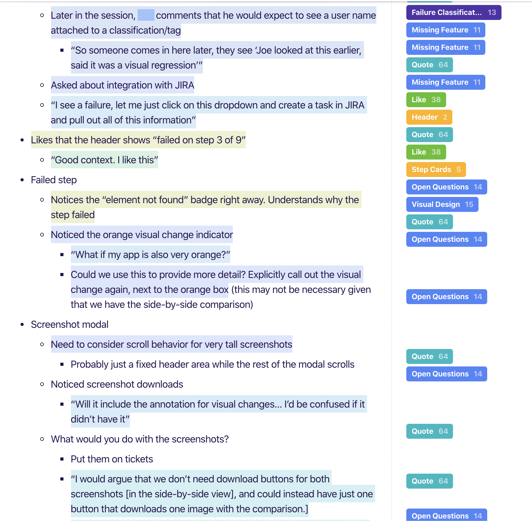
Dovetail enabled me to “zoom out” and look at the notes as a complete body of work.
Tags were added for user feedback, comments about specific components/aspects of the design, and to help identify changes and pivots from iteration to iteration.

Implementation
Final Design

Through a rapid cadence of test-iterate-test, I achieved a thoroughly validated design that performed well in usability testing.
This new design was proven to meet the needs and expectations that users had talked about during the discovery phase of the project.

The finished design had a few main points that made it such a success with users.
More prominent status
Clearly stated step-specific failure reasons
A more organized header
Glanceable elements that made debugging faster
For a test that passed, the test results page used to pick the last step as the selected step.
In order to avoid showing users too much too quickly, the new design replaces that behavior with a “passed state” of the details panel on the right.
This was a great opportunity to help users learn more about mabl.
The Did You Know carousel was a hit with users during testing, and has maintained high utilization post-launch. It is especially useful in helping to convert trial users to paid users.

The final design took the information that users cared most about and put it front-and-center.
These changes are what allowed me to demote the log lines’ importance by moving them a layer deeper.
They’re still there if a user needs them, but they are much less necessary.

Internal Reviews
After usability testing confirmed that the design solved the problem we set out to solve, I arranged demos and reviews with each other mabl team including sales, marketing, and customer support to help them prepare for their own conversations with customers and prospects
Collaboration with PM and Engineering
Our team made the decision to deliver this redesign incrementally.
Taking this approach was risky — the changes in the new design were enabled by and relied upon one another. There was a risk that we could negatively impacting usability if we weren’t careful and deliberate with our prioritization.
Working closely together, the team’s PM and I established the priority of work to provide value to users while making sure to pair related pieces of the new design together.
By the end of the project, our team had successfully gotten through nearly all aspects of the new design.
There were some lower-impact items that we were unable to get through, such as re-styling the timeline to fit the new visual design of the page.
All of the critical design changes (the ones users responded most positively to and got the most value out of) were completed.
Some UI components shown are existing, common components.

Post-Launch Evaluation
Problem Solved
The re-designed test results page performed well after launch:
Our prioritization of information was correct for most users. Less than 1/3 of users have clicked on the “view more” link in the header, showing that
Users edited their tests without needing to dig deeper. They read the new diagnostic info shown on the step cards , and knew what needed to be fixed.
The glanceable information is meeting users’ needs for debugging failed tests. Less than 20% of users clicked the “Logs” tab.
In addition to the hard analytics data above, users have gone out of their way to contact us to say how they like the redesigned page.

This project and all associated designs and process artifacts are owned by mabl. The parts of the project that I can share publicly are limited — shown on this page are select pieces of the overall project.