
Enterprise Dashboard
Problem to be Solved
In order for tools to be viable solutions for enterprise-tier companies, they need to operate well at scale and make user’s lives easier.
Enterprise-tier customers often have many sub-teams, each with their own workspace. Currently in the mabl app, admins have to switch to a specific workspace to see its run usage.
This was a problem that blocked enterprise customers from scaling mabl within their organizations.
Our goal was to design and build a single dashboard where enterprise-tier admins could easily see and manage test run usage across all of their workspaces.
Design Process
Discovery
Interviewed customers to hear about their needs for multi-workspace management
Benchmarked existing applications that handle multiple workspaces
Identified the “must haves”, and enterprise feature opportunities that weren’t related to this work, but would help tell a better enterprise story down the road
Iterate and test
Low-fidelity wireframes
Medium-fidelity wireframes
Multiple rounds of usability testing, rapidly iterating between rounds
Motion design
Implementation
Design documentation
Review with internal stakeholders and teams
Collaborate with PM and engineering
Post-launch evaluation
Analytics data
Comments from users
Discovery
Current State of the App
Before this project, users could see test run usage for a workspace only by going to that workspace.
If you’re an admin user who needs to manage multiple teams, this would quickly become a problem.
Imagine that your company has 20 workspaces. You would need to switch to each workspace, wait for it to load, and then get the data.
Rinse and repeat.
User Interviews
The team’s PM and I interviewed the mabl sales team to get a sense for what feedback they were hearing from enterprise prospects.
After talking with sales we did the same with the CSMs, who walked us through how they provide customers with this data today.
“Just before getting on this call with you I had to look at run usage for our 16 workspaces. It wasn't a great experience.”
— External user
“If I had some place where I could quickly zoom out and see what everyone at my company is doing, that would really unblock our efforts to expand mabl usage here.”
— External user
During user interviews, we asked users questions like:
What information are you looking for with respect to your multiple workspaces?
What would you do with that information?
Who needs to have access to a dashboard like this?
What would you do with the ability to allocate test runs to individual workspaces?


Iterate and Test
Wireframes and Exploration
Companies pay for N number of runs, and allocate those runs to their workspaces. Users needed a clear sense of what part of the available whole was being used.
If any particular workspaces were using too much of the available pool of runs, admins needed to see that quickly and it needed to be actionable.


Usability Testing — V1
Workspaces within a user’s company were laid out as cards in a grid, and each card displayed a set of information about that workspace.
This was a good first step, but the layout wasn’t as streamlined as it could have been. I wanted to remove as much unnecessary information as possible.


Apart from the busy layout, this version had a more core problem: users struggled with understanding the relationship between all of the numbers shown.
The relationship between all of these numbers — the company usage percentage; workspace usage percentage; workspace test runs — had to be crystal clear.
“The 18% — is that 18% of the total company usage? Or is that 18% of the runs I've allocated to that workspace? “
— External user
Usability Testing — V2
Taking into account how V1 performed, V2 made a number of changes to improve the design
The layout was simplified and the cards dropped any information that was not absolutely critical.
The dashboard was presented on a full-screen modal to make clear that it lived above the workspace level and would travel with users to whichever workspace they happened to be in.
Workspaces that had met or exceeded their allocation were moved up into a “needs attention” section.


Users continued to struggle with the relationship between the all of the numbers. The simplified cards did help make the dashboard feel less busy but the percentages remained problematic.
Users were very enthusiastic about the “attention needed” section, which helped them quickly drill down to where they needed to focus.
Usability Testing — V3
V2 performed much better than V1, and there was room to improve things even more.
V3 made the following changes:
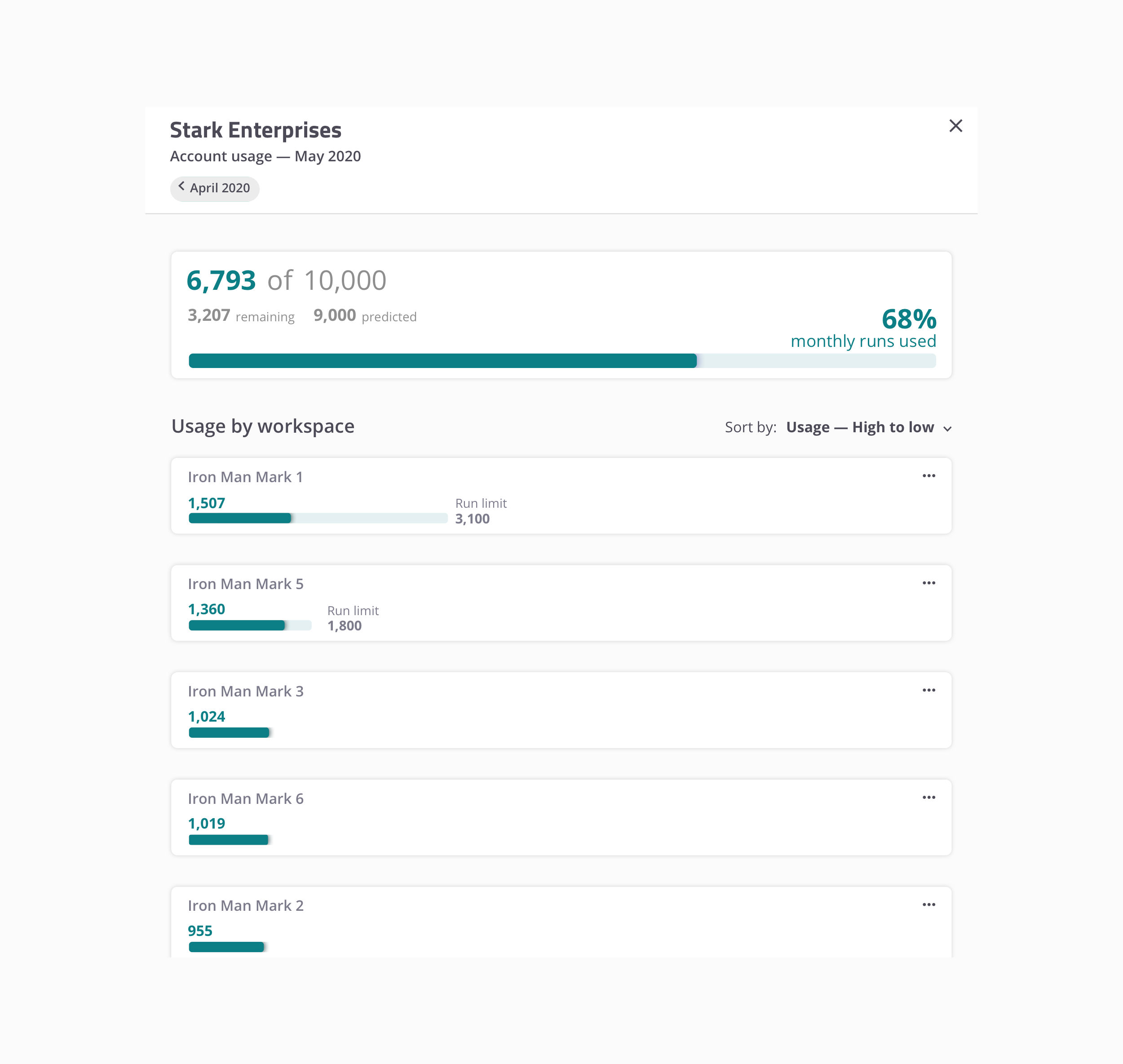
Simplified the workspace cards even further — the percentages on the cards were removed along with the bar that represented the remaining test runs.
Introduced a user-facing control for allocating runs to specific workspaces.
Single-column layout
Instead of a grid, V3 switched to a single column layout, making it much easier to read and scan through quickly.
The single column layout also helped establish the necessary part-of-a-whole hierarchy between the workspaces and total available runs.
After switching to a single column layout and removing the percentages on the workspace cards, users were able to get a clear sense of the relationship between the data shown — the core problem from V1 and V2 was solved.


The attention needed section tested extremely well with users.

Admins can pause workspaces, preventing them from executing additional cloud runs.

If the overall company usage exceeds a certain threshold, the summary block is put into a warning state.

If the overall company usage meets or exceeds the total available number of runs, the summary block is put into a different warning state.

Users can set run allocations for each individual workspace. This allows them to prioritize certain groups in their org, and control operational spend.

In V2, each card had a bar showing the total company runs remaining which was confusing for users.
That bar was repurposed to show the remaining tests runs for that workspace, and only shows up if an allocation is applied.
Evaluation
Internal Reviews
After usability testing validated our approach, I demoed the designs for the engineers and PM.
We discussed the usability testing results and identified which parts of the dashboard were less critical as an MVP
We decided what had to be included in the MVP, and mapped out a timeline for following up with the less critical pieces of work.
Everything that users told us they absolutely had to have was included in the MVP. The areas we identified early on as being the “above and beyond” features were slated as future improvements.
Problem Solved
Our usability testing confirmed that our design solved the problems we set out to solve.
The team was able to deliver on our vision and the dashboard was successfully launched to users.
Not only did we solve the immediate needs of our enterprise users, we defined a plan to continuously deliver new features after launch in order to tell the best enterprise story possible for future prospective customers.

This project and all associated designs and process artifacts are owned by mabl. The parts of the project that I can share publicly are limited — shown on this page are select pieces of the overall project.